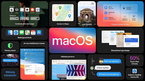
What's new in macOS Big Sur? Overview of Key Features
What's new in macOS Big Sur? Overview of Key Features: Shaikh Inside
The beta version of macOS 11 Big Sur, in full accordance with Apple's instructions, was installed on an unoccupied Intel Mac, and not without fear (researchers are developing software for Mac, each new version is stressful) and began to study it. Their first findings: it’s definitely still macOS. Life goes on. This time, the changes are “higher than the roof,” some of which cause slight bewilderment, but no serious crime was revealed in it for a week of testing. In what is striking (in the design of the interface) it is different.What's new in macOS Big Sur
At WWDC, it was called macOS 11. In the "information about this Mac" (in the "Apple" menu) it is "macOS 11.0". But inside, in the thousand and one places of her digital insides, she is still macOS 10.16. From the first day of the new macOS resulting from the merger of the classic Mac OS with NeXTstep, up to macOS 10.8 Mountain Lion, its major versions were named after the "big cats". By the fall of 2013, cat-worthy Mac names were over - and tradition had changed.The names of the noteworthy places in California, the company's native staff: Mavericks (10.9), Yosemite (10.10), El Capitan (10.11) and so on, were used. Big Sur continues this tradition. This is a mountainous and sparsely populated area on the Pacific Ocean in central California, a popular holiday destination. And all the main attractions of macOS 10 are also inherited in macOS 11: the menu bar (it has become even more airy and transparent, “so as not to distract the user’s attention from the content”), and with the dock (in 2001, critics raged about it, wondered how such a stupid idea might have come to someone at Apple) nothing terrible and radical has happened.
 |
The new menu directly brings back memories of iOS 6 |
 |
| Charge level of connected Bluetooth devices In the last years of the life of the classic Mac OS, incredible innovations appeared in it. I got used to some of them almost instantly, I really liked them - for example, “tear-off menus”. In the system and in some application programs, some of the menus could be dragged onto the screen - they turned into ordinary Mac’s windows. A very similar (but less convenient) phenomenon was in the NeXT operating system. When switching from classic Mac OS to Mac OS X, this functionality was sacrificed. Something did not work out, and decided not to suffer. They promised to find out sometime later.  |
Control Center, now on macOS
In macOS 10.13.6 on my working MacBook Pro, in order to get to the calendar, calculator or other useful things, you have to climb to the notification center over and over again. On macOS 11, using them is much more convenient. The function that serious adults enjoy playing with, dragging something on the menu again and again and removing them from there, deserves applause. This small (but pleasant and useful) step in developing the functionality of the menu system is encouraging: it was impossible to drag and drop objects from the menu to the desktop in the late 90s. And not that this was a fundamentally insoluble problem, it was just that the developers had too many much more important and serious problems that needed to be solved.

This is how widgets look like in macOS Big Sur
New Dock on macOS Big Sur
The icons in the dock are rounded, their outline now (as in iOS and iPadOS) is a square with uniformly rounded edges. All Apple operating systems will be of the same blood very soon. The process is already underway. Over the next two years, macOS will get rid of the legacy of the past and will work with the same ARM processors as the rest of the company's OS, from audioOS in HomePod to watchOS.You have to get used to the new dock
But bringing icons in the dock (and not only) to a common view with everyone causes bewilderment. It would be better if they did the exact opposite, but neither I nor the researchers insist on this. The fact that the icons have gained volume and are inscribed in geometric shapes of a standard form does not play a special role, does not irritate and does not distract from the important. For the rest, the dock remained a dock, they did not deprive us of anything.Should i install macOS Big Sur?
For the first beta, it’s very much nothing. There were far more restless and even dangerous first beta versions for developers. Many kernel extensions after its installation are buggy, there are problems with the system integration service (security service), it is recommended to turn it off.Panic and other manifestations of newborn OS occur, but rarely enough. Xcode 12 (also beta) works - but about it some other time.
The Spotlight search engine and its excruciatingly long and cumbersome indexing for the computer have been improved and optimized, but it still feels. Will everything be different on Mac'ax with Apple SIlicon? It is impossible to identify all the troubles in one week, in July (already this month) the public beta version was subjected to more diverse tests, and something will definitely come out of its bowels. In the meantime, calm, non-disclosure agreements, confidentiality.
Subscribe to all our social networks:
Loved our content? To support us for More Content, you can help us via UPI : Paytm: ShaikhInside@paytm GooglePay: Enquiry2Info@okaxis📲 Google Pay: Enquiry2Info@okaxis
Join me on Google Pay, UPI a secure app for money transfers, bills, and recharges. Enter my code 1n9g4 to earn ₹21 back on your first payment! https://g.co/payinvite/1n9g4


Comments